Portfolio
My Work
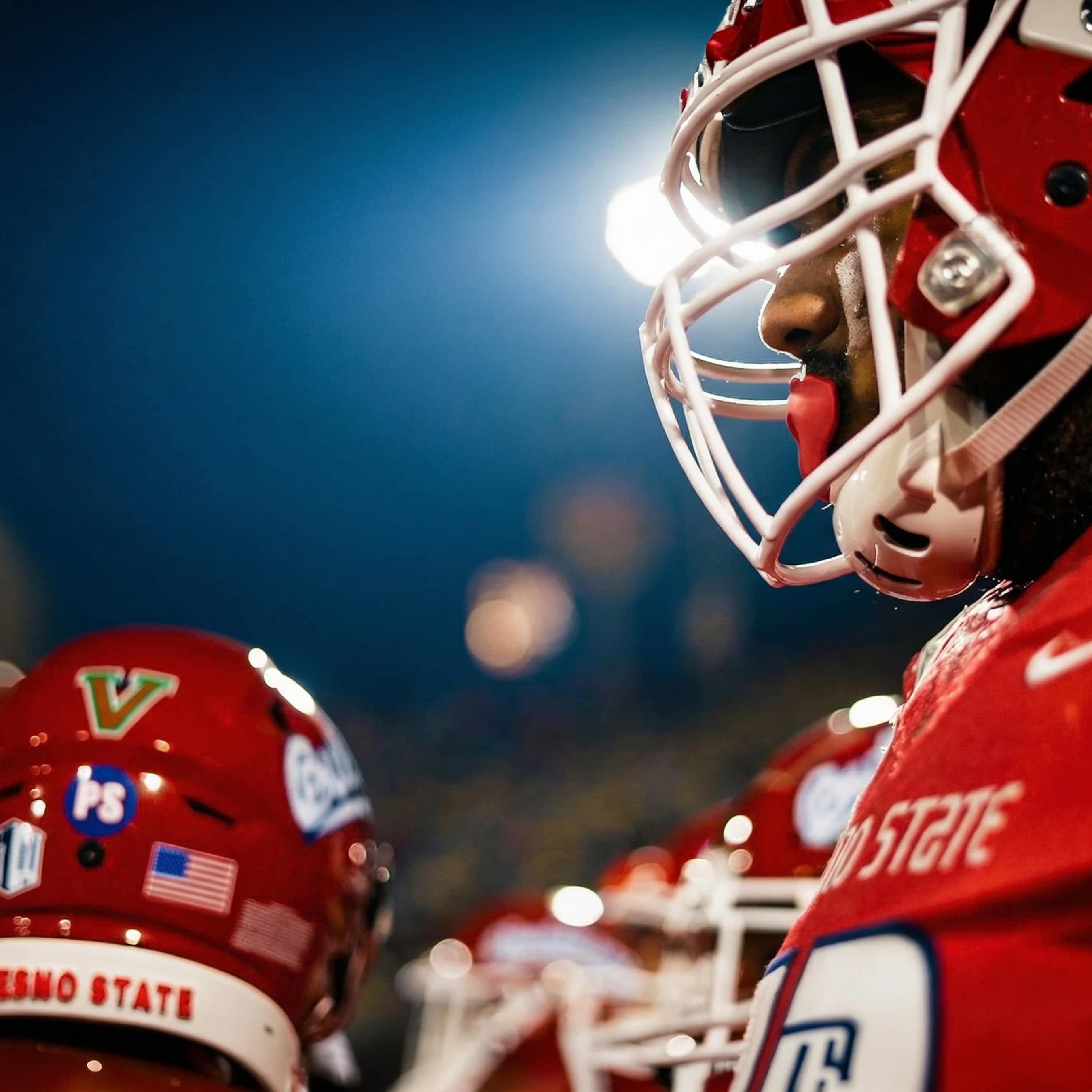



Work in Progress
Brand Identity Development
This identity required more than design execution. It required the ability to hold a philosophy and translate it into form without losing either side. Below is a breakdown of what went into the work.
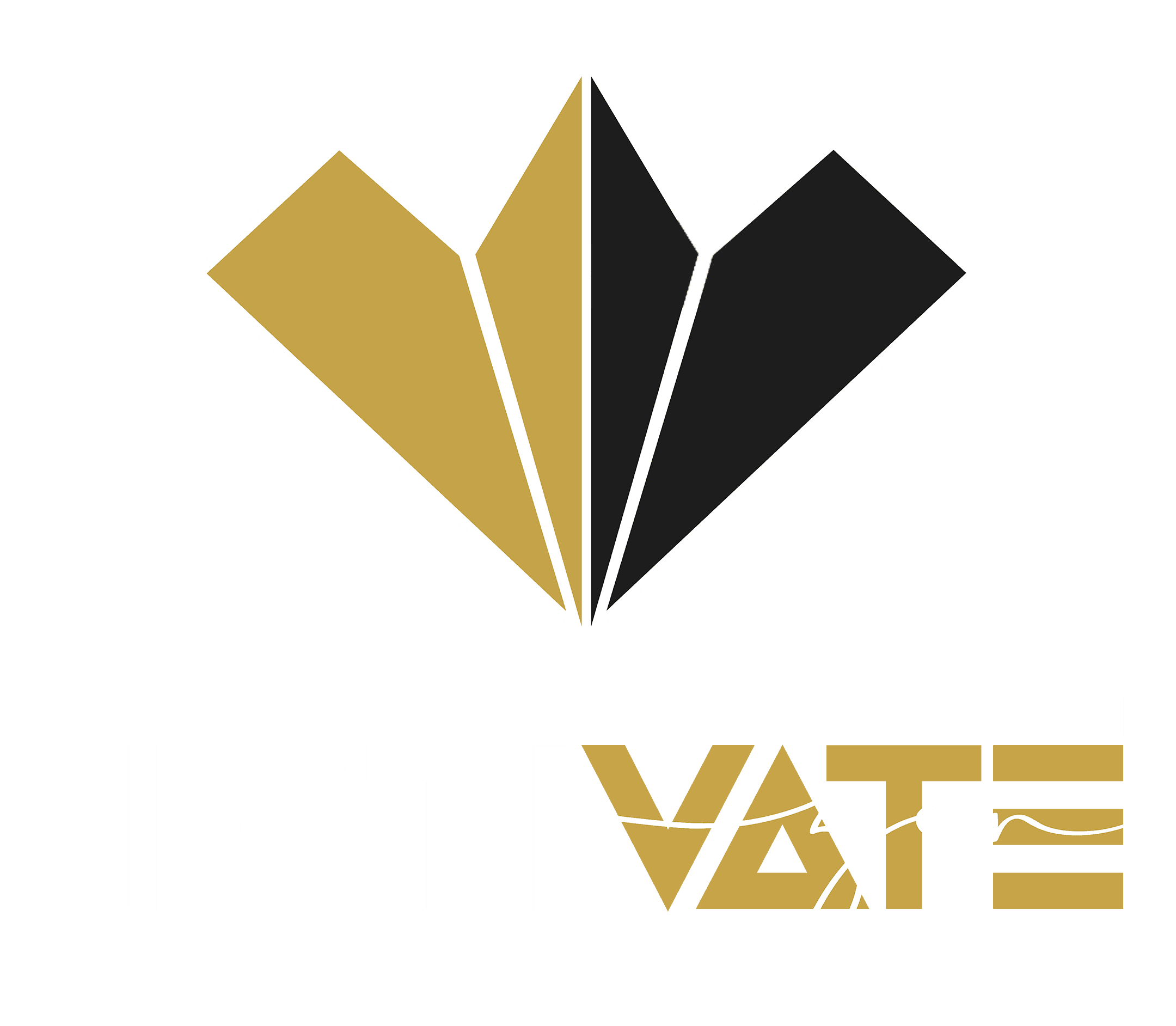
Personal BrandCreative IndustryValues: Speed & Precision
Brand Strategy & Positioning
The brand had to know its own foundation before any visual existed. Two cities, one diamond, one journey between them — that single articulation became the spine every design decision had to answer to. Strategy is not the layer applied on top of the work. It is the layer the work is built on. Most brands skip this step because naming what they actually stand for is uncomfortable. That avoidance is why so many identities feel hollow within a year.
Conceptual Development
The diamond as ego, the bold wordmark as motivation, the script as the calming exhale. None of that is accidental, and none of it was assigned by a brief. It was built from the inside out, which means every element earns its place by carrying meaning, not by filling space.
Logo Design & Typographic Construction
The MOTIVATE wordmark uses custom geometric construction with art-deco architectural detail inside the M, V, A, and E. The zen script was selected to weave through the wordmark with a deliberate weight contrast, creating the visual exhale the brand calls for. The diamond mark was built on geometric precision, with the gold and black halves balanced by negative space acting as the central axis.
Color System Development
A muted antique gold paired with a deep near-black and pure white. Three colors, no exceptions. The palette was developed to honor a specific philosophy about ego, foundation, and awareness, then field-tested for legibility, contrast, and emotional accuracy across light and dark applications.
Brand Voice & Copywriting
The visual identity was developed in parallel with the written voice. Bold motivation that knows when to soften. Quiet observation that knows when to take up space. Every line of brand copy was written to match the rhythm of the mark itself.
System Thinking & Application Design
Primary logo, secondary variant, diamond mark, icon. Dark mode, light mode. Photography direction, typography pairings, color ratios, application rules. A brand is not a logo, it is a system, and a system has to work everywhere or it does not work anywhere.